Aligning Business Goals with Information Architecture
Client:
Your Hobby Place
Team:
1x Information Architect
Tools:
Figma/Fig-Jam, Optimal Sort, & Maze,
Time Frame:
5 weeks
Responsibilities
I spearheaded the entire research process from end to end. This included designing, implementing, and analyzing tree tests and card sorts. I was responsible for managing all research operations and handling participant incentives.
Context
Who: Your Hobby Place (YHP)
YHP, a leading hobby and collectibles shop in the DMV area, offers a diverse range of products. From Magic the Gathering to Dungeons and Dragons, YHP caters to all hobby enthusiasts.
What: E-commerce Site
YHP boasts an e-commerce platform, streamlining Magic the Gathering singles sales. This site simplifies the purchasing process, enhancing customer experience.
Executive Summary
Problem
Current information architecture is not meeting business goals
The rapid increase in Magic the Gathering product releases has overwhelmed the information architecture (IA) of Your Hobby Place's e-commerce platform. The IA no longer matches our business goals, hindering our overall strategy.
Magic has a global player base of 40 million, with market research indicating that about 80% play for fun rather than in tournaments. Commander, a social play style, is preferred by 70% of players.
A shift in IA is needed, from focusing on tournament players to engaging social ‘Commander’ players.
Solution
IA redesign based on new target user segment
To better serve social ‘Commander’ players, I revamped the information architecture to mirror their mental models.
I streamlined the main navigation bar from +100 options to just 6. Each category is informed by a decision strategy in tandem with the mental models of users.
Unique Challenges
Managing Large Inventory: Addressed the challenge of ever-growing stock (+27,000 cards and +200 set releases) in collectible shops, a result of continuous product line expansions.
Exploring Sets to Explore Singles: GIF illustrates each set's average of 200-300 cards. Currently, there are over 27,000 unique cards.
Outcomes
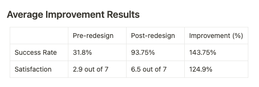
Implemented both quantitative and qualitative tree tests to manage large inventory. Over 100% user satisfaction and task success increase noted after our tree testing.
Tree test results
Generative
Aligning user and business needs through strategic mental mapping
More Magic sets since 2019 challenge Hobby Shops in product sorting. To understand the problem area, developed the following research & design plan:
Gantt Chart of Research & Design: documented our use stakeholder interviews, tree testing (benchmarking), competitive analysis, open/closed card sort, site mapping.
Stakeholder Interviews
Bridging Business Goals and Information Architecture through Collaboration
Key priorities:
Design a scalable system: Designed IA to be resilient and adaptable for future products.
Promote Universes Beyond: Magic sets now include diverse intellectual properties, attracting new users.
Prioritize Commander: Identified as the highest-spending user group.
Heuristic Evaluation
Revolutionizing IA Usability with a Top-Down Heuristic Method
I applied Abby Covert's IA Heuristic Framework in this project.
Two key priorities:
(1) Findable: 'Magic Singles' click leads to a 100+ option navigation bar. Fun commander cards are not easily accessible to newcomers.
Original Navigation: Users are greeted with 100+ options when they select Magic Singles.
(2) Delightful: The IA should make discovering 27,000 cards joyful.
Presently, set-based exploration lacks an organized structure. The inconsistent use of thumb nails kills the delight.
Original Magic Singles Landing Page: Clicking on magic singles greets users a giant list of +100 sets, and some of the cards include images while others do not.
Current State Audit
Original Site Map Pre-redesign: the green boxes highlight two categories of +100 path options.
The sitemap showed most Magic singles were grouped in two 100+ categories:
“Magic Singles” landing page
“Special Editions”
Moderated Open Card Sort
Harnessing Social Players' Mental Models
Conducted an open card sort with 8 social players, chosen for their high spending potential. (users were compensated with a Magic booster pack). These players, being our target audience, typically invest more in the game.
Budget limitations meant using Optimal Sort's free 20-card limit. The test was moderated.
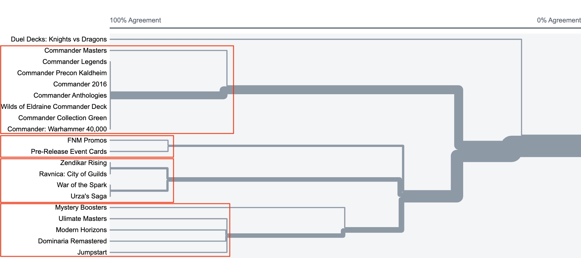
Closed Card Sort Agreement Chart: red boxes mark the four key categories for social commander players.
The card sort exercise illuminated four distinct categories in addition to categories provided by stakeholders:
'Standard Set Releases' emerged, encompassing cards eligible for tournament play.
Separate category for 'Promotional and Events' cards was identified.
'Commander,' stood out as a dedicated segment.
'Non-Standard Releases' and non-commander products
Content Design
I crafted an information architecture focused on immersive content design and strategy
UX Writing
Using Open Card Sort Labels as a Springboard for Content Ideation
A key challenge was ensuring labels encompassed diverse products effectively.
For instance, the 'Commander' label had to cover both starter deck singles and official set releases.
Content Sketching: documenting our ideation session.
Content Strategy
Aligning User Mental Models with Product Findability and Promotion Strategy
I decided to remove the 100+ options and “Magic Singles" and create 6 main categories. These were based on business goals:
Standard Sets: includes any set released for standard tournament play.
Commander Editions: encompasses all singles related to Commander products.
Universes’ Beyond: covers products featuring intellectual property external to Magic.
Special Editions: comprises sets and products that are neither standard sets, Commander, nor Universes Beyond.
Promos & Events: any card that exists outside a special or standard product set (e.g., special printing or alternative arts).
All Set Releases: all sets in alphabetical order.
Navigation Bar Redesign: I was able to consolidate +100 navigation bar options into six.
I maintained design choice of cards-as-buttons approach to attract new players with artwork. I limited sets three cards per row (from four).
Commander Editions Page: designed categories for user exploration paths, alphabetized under 45 options.
After setting main categories, I grouped products lines, such as all the Planechase sets.
New Magic Singles Site Map: the largest category has 45 paths.
I grouped product lines strategically to leverage our 'featured product' website feature.
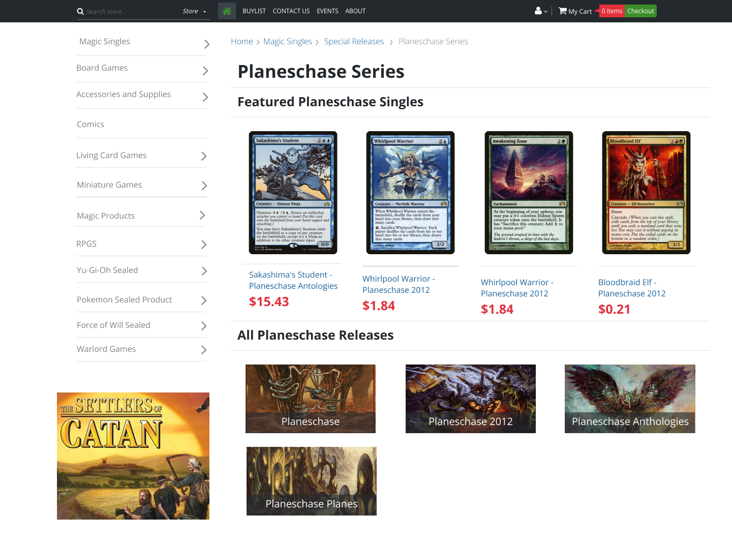
Sample User Path: user explores Special Releases and stumbles upon the Planeschase Series.
Our “featured product” page groups items for user discovery and engagement.
Sample Featured Product Page
Evaluative Research
Benchmarking success involved integrating quantitative data with qualitative feedback.
Usability was key to maintaining player immersion in our experience. Closed card sorting helped us test and refine our labels' usability. Tree tests were used to benchmark our existing and new IA.
Closed Card Sort
Evaluating the Reliability of New IA Labels for Enhanced Usability
The feedback from social players in our closed card sort was instrumental in testing our labels (users were compensated).
Due to budget constraints, I couldn't use platforms like Optimal Sort for sorting over 100 products. Limited to 20 cards, I used the same set from the open card sort.
I achieved an average of 95% category reliability.
Closed Card Sort Agreement Chart: the goal was to achieve a 75% agreement on categorization, which was successfully met.
Tree Testing
Benchmarking IA Designs with Targeted Tree Tests
Performed a moderated tree test, limited by the free version of Maze.
Gorilla recruiting: chose 8-11 store patrons to ensure a user-specific mental model (users were compensated).
Metrics:
Quantitative: task success rate.
Qualitative: task likability score.
Methodology
Task 1: Show me where you’d find individuals cards from the Commander Legends set.
Task 2: Show where you’d find individual cards from the Kaldheim commander pre-constructed deck.
Average Outcome
Conclusion & Next Steps
My project successfully aligned business objectives with our revamped information architecture, showcasing the optimal intersection of business goals and user experience. It also aligned user expectations with the final products. This alignment underlines a key principle in UX design: the best user experiences emerge when they are in harmony with business strategies.
Looking ahead, the next phase involves launching the new information architecture and content strategy at YHP. This will be a critical step in ensuring that the theoretical improvements translate into tangible benefits for users.
Furthermore, I plan to conduct a closed card sort with 30 cards to establish more nuanced subcategories within the five main categories. This finer categorization aims to streamline the user journey even further. Alongside this, there's an opportunity to refine our labels through content testing, ensuring that each term precisely resonates with and aids our users.


