My Role:
UX/UI lead, UX researcher, content strategist
Organizer:
Team:
2x project managers, 1x UX/UI Lead, 3x UX/UI designers, 8x developers, 2x data scientists
Timeframe:
12 weeks (part-time)
Tools:
FIGMA, Google Suite, Zoom, Otter AI, Chat GPT 4
Responsibilities
WHO: TOP x GA
The Opportunity Project (TOP), under the U.S. Census Bureau, transforms federal data into data sets for tech challenges for industry and education. General Assembly (GA) offers training in tech, data, and design.
HOW: Streamline COVID-19 Reporting
Our aim was to empower users by simplifying the COVID-19 at-home test results submission process, leading to the creation of the Community Test Lab mobile application on iOS and Android.
Led a trio of UX/UI designers in devising a comprehensive end-to-end research strategy. Oversaw the development of a scalable design system. Served as the primary liaison between our design team and the developers, ensuring seamless collaboration.
WHAT: Empowering Patients
GA joined a 12-week TOP sprint, tasked by this year's challenge from the Food and Drug Administration. The FDA challenged GA graduates to create tools to empower patient taking leadership of their health data.

Executive Summary
Problem
According to the CDC, users took 300 million COVID-19 self-tests (76% of production). Just 10.7 million (3.6%) reported outcomes, (2022).
Users are not reporting for two key reasons:
Trust gap: Users have reservations about giving health institutions their data.
Value doubt: Users question the worth of spending time reporting their test.
Solution
Outcomes
We created Community Test Labs: an iOS and Android mobile app, which provides two ways of reporting:
Effortless Reporting: Users can auto-fill profiles for 3-click streamlined reporting.
Secure Reporting: Private reporting allows users to submit their tests without providing identifying information.
COVID-19 Data Dashboard: users can see updates on public health
Collaborated with a development team to create a React Native mobile app.
Usability
Through reports, identified a 10% reduction in misclicks.
Optimized functionality, raising task completion rates by 5%.
Generative Research
Through UX research, we pinpointed gaps in reporting at-home COVID-19 test results
Health Expert Interviews
TOP linked us with five user advocates. Their expertise including public health, public trust, and patient advocacy.
Research Questions
Public trust: Understand how does public trust influence attitudes towards sharing health data?
Empowering habits: Describe how we can make users feel empowered to make reporting a habit?
Key Findings
Historical mistrust: Users have always already been skeptical of government and hospitals.
Prioritize privacy: Users value privacy, anticipating future health data implications.
Focus community: Users eagerly share data for bigger, collective goals.
American User Interviews
Interviewed US residents to uncover breakdowns between COVID-19 testing and result reporting.
Research Questions
Reporting Attitudes: Identify users' attitudes towards the test taking and reporting process
Trust as Decision Making: Describe how users navigate the decision making process of sharing their data
Methodology
Scope: Explore how users decide to self-report test outcomes.
Targeted Recruitment: Interviewed 12 users tested for COVID-19 in the past year.
Remote: Held interviews over Zoom.
Collaborative Synthesis: Analyzed results collaboratively in a FIGMA workshop.
Key Findings
Needs: Users need two ways to report:
An “anonymous” option.
A swift 3-click reporting process.
Privacy Transparency: Users seek transparency in our data handling policies - a precursor to trust.
Design & Ideation
Our design strategy: turn healthcare data sharing into a community-building activity
Feature Prioritization
Our 12-week sprint dictated a prototype design and development timeframe. Any design had to be achievable by developers within this period.
Onboarding
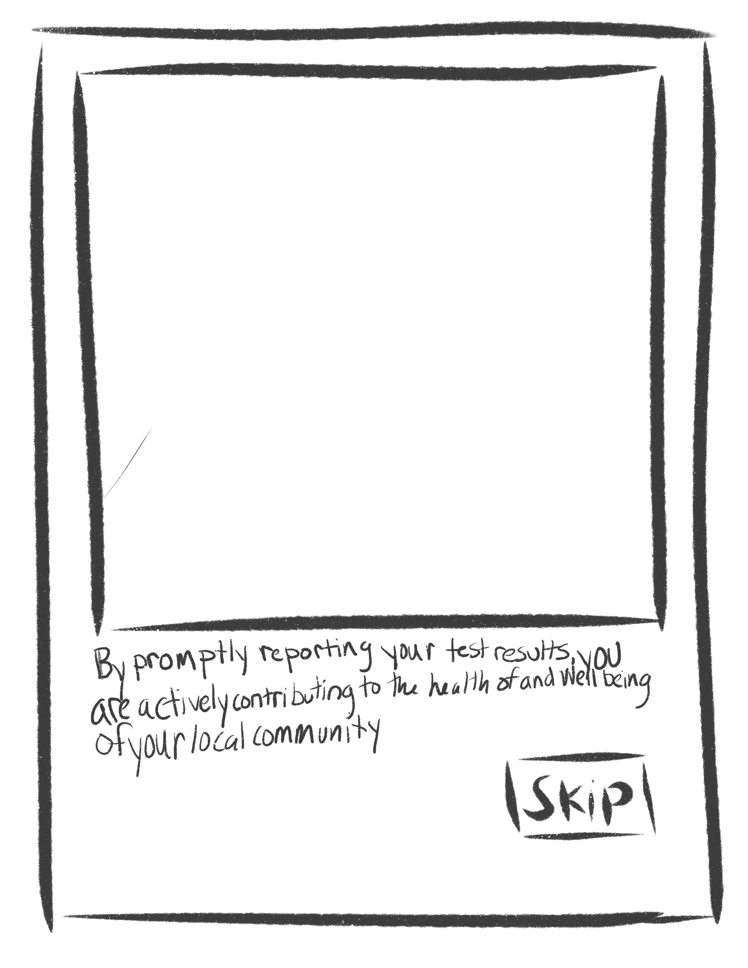
To foster trust, we emphasized data safety during onboarding. We explained to users how their data would be used, how their data would not be used, and the impact of users sharing their data.

Covid Dashboard
The FDA requested we use data sets for feature development. We designed a one-page dashboard for seamless decision-making. Such as, “is it safe for me to grocery shop in person today?”

Private Report
Users desired secure test submission. We designed an account-free option for submitting results.

Quick Test Report
Report in 3 clicks or less. We chose a single-page report to minimize drop-off.
Style Guide
We chose a blue shade as our primary color to convey trust, and complemented it with orange to add contrast and vitality.
Prototype Highlights
Data safety is paramount for users’ data sharing.
Trust-building starts the instant users open the app.
Dive deeper into this trust building journey in another content strategy case study here
Our goal was to harmonize our data collection with existing public health programs.
The report aims to let users submit within 30 seconds.
Profile data auto-fills your Zip Code and Date of Birth.
All user profile data automatically accompany test submissions.
Tasked by the FDA to design a feature utilizing federal open data sets, we created a data dashboard spotlighting past COVID-19 statistics.
Recognizing the CDC's national COVID-19 indicator as a crucial determinant in our user's decision-making process, we made it the central focus, aiming to clarify the presence COVID-19.
Developer Collaboration
UX methods helped us communicate user issues and our product vision, aligning the team
Teamed up by General Assembly, we collaborated with developers and data scientists. I spearheaded the communication of our vision for realization within a 12-week sprint.
To balance the demands of data science and development, I utilized a gantt chart. This tool helped orchestrate collaboration and track project progress.
Data Collection & Storage

These wireframes served as visual guides, fostering a shared understanding of the app's design.
Aligning stakeholders to a common vision
Initially, our developers and data scientists were unclear about our goals, leading to us utilizing story mapping.
Story mapping was our strategic tool to focus in on MVP product functionality.
"Community Test Labs" story map: featuring The Impactful Guardian's COVID-19 test reporting dilemma.
Engineers Collaboration
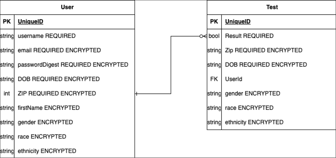
The entity relationship diagram: showcases different data being stored.
From day one, engineering input shaped our journey from ideation to prototype creation. We shared wireframes immediacy.
We employed agile design sprint on a weekly basis to ensure development was active throughout the entire 12 weeks.
One constraint was that developers were building with React Native.
Story Mapping
Final MVP
Our data strategy was based on CDC's MARsX program data collection best practices, focusing on essential test and demographic data: test result, test date, zip-code, gender identity, age, race, ethnicity.
To align our team, we crafted an entity relationship diagram as a guide.
We achieved a remarkable milestone! In just 12 weeks, our dedicated team managed to research, design, and build our MVP.
This rapid development was possible thanks to the extraordinary efforts of our developers. Leading the charge, our software engineer Stephan Ramalho prepared an impressive recording that showcased our final MVP. Check it out bellow.
Watch our lead engineer showcase our MVP to TOP and FDA in this video.
Evaluation
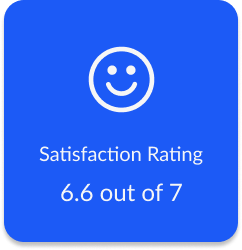
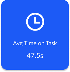
Benchmarking success involved integrating quantitative data with qualitative feedback
Usability Tests
Methodology
Our team conducted mid-fidelity tests (23 users) and high-fidelity (27 users).
Maze was our go-to due to budget limits, restricting question scope. To achieve benchmarking, each task ended with a single ease-of-use questions.
Users were tasked with reporting tests, both with and without accounts.
Report Test
Mid-fidelity


On the left, is a heat map showing misclick rates, and on the right is our iterated design
High-fidelity testing


On the left, is a heat map showing misclick rates, and on the right is our iterated design
Data Dashboard
Mid-fidelity test


High-fidelity test


Next Steps & Takeaways
I deeply enjoyed my time building and creating Community Test Labs. These are our next steps:
Design a vaccine passport: some users expressed frustrations with keeping up with their vaccine history, and this feature would stream line the process
Collaborate with other institutions: we collaborated with the FDA to make sure we were capturing good data. Next time, I’d find out how we could make our app help institutions like the university system.